Showing posts with label swatches. Show all posts

Monday, November 25, 2013

Divine Night Mineralize Skinfinish

To be honest, I wasn't too impressed by the Christmas range that MAC was releasing for the 2013 year. I thought maybe an eyeliner, a lipstick or two would be all that I would get from the entire line (not even the bags or kits really screamed out to me), but as I went into David Jones the other day before work, I swatched the gaudy-looking Mineralize Skin Finishes from the Divine Night range, and ooh. My interest was captured again. 


I actually wanted the shade Perfectly Poised, which gave this nice gold sheen with a pink reflect, super pretty shade. But unfortunately, David Jones had sold out of that one, so I went across the road to Myers... Where they also happened to be sold out, and where the lady then started to try push all these other products on me. To which, I decided that Scene to Be Seen was actually quite nice too... And they had sold out of that at Myers as well! Why did she up that particularly product to me when it was also out of stock? And then she started to push other products on me too, that weren't even remotely related. I tailed it out of there saying I had to head to work, and thanked her for her help (why did I thank her). Anyway, I actually went back to David Jones to see if they had Scene to Be Seen in stock, and they did and they were lovely, and this is why I constantly choose to go to David Jones over Myers. But either way, I was able to grab Scene to Be Seen (and later noticed that Perfectly Poised is in stock online, so might pick that up later too... It was just so pretty!), which is described as a mauve with a pink sheen/brick rose with gold reflects.


left to right, without flash: inner part, outer part, mixed, blended
With Flash
I would describe this as quite the plum-toned Mineralize Skin Finish, but a mauvey-pink is quite accurate. I love the result that you get from blending this out on the skin, the pink and gold shimmers look absolutely wonderful, especially on my medium toned skin; and, I assume, as my skin will tan a bit more with the warming weather, this can give that ethereal look. This can be built up to be used as a blush too, but that will take about four layers or so, as this blends like a dream on the skin. I think one of the nifty things about this Christmas range of Mineralize Skin Finishes is that there are essentially three options of shades: the inner part, the outer shell, and mixing it together.


I've never owned a MSF before, and I can really see the appeal of them now. They're so smooth and finely milled, it really adds a nice touch to the skin at the end. This shade is probably best that it came about in the holiday season, I don't see much opportunity to wear this (although I probably will, screw "appropriate" makeup), it will really look nice to give that sun-kissed glow, so that's a nice addition to a summer tan or that "festive cheer" you get from a little bit of bubbly.

Saturday, November 23, 2013

Veluxe Pearlfusion in Greenluxe

I never used to be such a fan of eyeshadow palettes. I preferred my individuals, but as I'm starting to accumulate more and more makeup, why not save a bit of space and purchase a palette? I was so keen to get my hands on the Veluxe Pearlfusion Palettes by MAC, they looked just so goshdarn pretty and different to all the other shadows I've ever owned. I mean, I've never really been too big a fan of shimmery eyeshadows, but something about these palette screamed special to me. So much so, that I ended up purchasing the smokeluxe palette while waiting for my mother to return with my first requested greenluxe. And boy was I right to wait for greenluxe; it is quite possibly the prettiest palette ever.


Firstly, I love the packaging, of course. It's the usual MAC palette packaging with the clear front and the magnetic closure; but I really like how the colours are separated into shimmer strips (akin to that of Bobbi Brown) yet are separated by a thin line of plastic. Some people have said that it's difficult for them to get their brush in, but so far I have had no problem, although I do use smaller brushes to accommodate my smaller sized eyes. I was so intrigued by the greenluxe palette, simply because of the nice cool tones and the slightest pink/green tint to it. Pretty much because I thought it contained cute and pretty colours, nevermind that it might not "suit" my skintone too much. I make it work.


All of these shades were a lot more shimmery than I was expecting, I mean, they're veluxe pearl, but at least two of these shades are definite glitters. The lightest shade looks pink with a silver shimmer that turns more silver on my eyes (removal of the pink). The second lightest shade appears to have a green tinge in the pan, but when swatched, it's basically a very pretty, very smooth multicoloured glitter; the photos don't really do it justice as it looks amazing in person. The middle shade is a satiny-taupe colour, good for an all over colour to bring a bit of life to the eyes (I'm also assuming that's what was in mind considering the size of this shade in comparison to the others). The next shade is the darkest in the palette, being a deep brown with gold/green glitter in it. It was a bit hard to swatch this one, and needed a bit more effect to get the colour payoff shown. The last shade is akin to that of club eyeshadow or blue brown pigment, where it is a brown base with a blue/green duochrome. Glad I had this palette which saves me from purchasing club. 


While it probably is that I won't get the most use ever out of this palette, it is quite a good one for the holidays coming up, what with all the shimmery shades; although, I could probably at least use one shade a day in any look to add a bit of pop to my eyes. It really is one of the prettiest palettes that I own, and definitely one of the most unique, so I'm quite glad that I was able to get my hands on it. 

Monday, November 18, 2013

Em Cosmetics Beach Life Palette: Cabana Party

And so it comes down to the last (well, rather, first) quadrant of the Em Cosmetics Beach Life Palette which features a selection of pinks and browns. It doesn't really scream out Cabana Party" to me, but I didn't really know what to expect considering the previous quadrants, with a giant bag of hit and mix.


I swear, I should not have expected much from the highlight shade. Seriously, if 2/3 of the previous highlight shades were terrible, you would assume based on probability that it would be just as terrible. And yeah, it was. The next two pink shades proved quite pigmented and mostly smooth too, the deeper pink shade a bit more chalky. Then the next neutral matte wasn't too great, but I'm thinking that Em Cosmetics just does not fare well for mattes. The only thing that's been decent is the satins, but you can't just make a look out of satins, right? The grey matte shade was pretty bad too, but the brown was a bit better, although not quite so matte so my theory holds true. 

The lipglosses/lipsticks in this quadrant were quite a bit of a nicer surprise, they were pigmented and smooth, although they still had that sticky feel to it. The darker pink shade leaves a deep pink stain onto your lips which I find to be quite attractive, perhaps looks better than the "stained glass" look of the lipstick itself.

The blush is quite nice as well, it doesn't have any glitters or is overly shimmery, maybe just a slight satin finish, but it is mostly matte. It's quite the pigmented blush too, but seems to pretty much blend out. So that's not really the best type of blush, but it's pretty enough... Still probably not the right shade for my skintone - just a slight bit too deep I think.

Without Flash
With Flash
Applying the eyeshadows on the eyes were pretty much the same pigment, I would recommend using a natural fiber brush rather than a synthetic brush just so you can get more punch out of the shadow. I quite liked the formation of shadow in the Cabana Party look, possibly one of my favourite looks given out of the Life Palette. Though I will say I don't really know when that light shimmery mauve toned pink shade would be used (maybe on the lower lash line for a pop of colour?). 

The blush applied as I thought it would, overly pigmented but still blended away so I don't know what to think of this blush besides... Cheap.

The lipgloss was pretty okay, but, again, I prefer the stain over the actual product itself.


Before
After


This is pretty much the epitome of the palette, where the shades are half there, the other are a surprising shade and the blushes could go either way. The lipglosses however are different in this quadrant, in that they are quite pigmented, but I think you could tell from looking at them in the pan. They still maintain the same stickiness of the other glosses and don't have much of a longevity. The combinations of the colours in this quadrant was quite nice however, the pinks look fantastic on the eyes and go well with the deep browns. The lipsticks and blushes leave something to be desired in terms of the overall style. But this quadrant really is a summation of what you would expect roughly of the palette. 

Sunday, November 17, 2013

Em Cosmetics Beach Life Palette: Summer Getaway Look

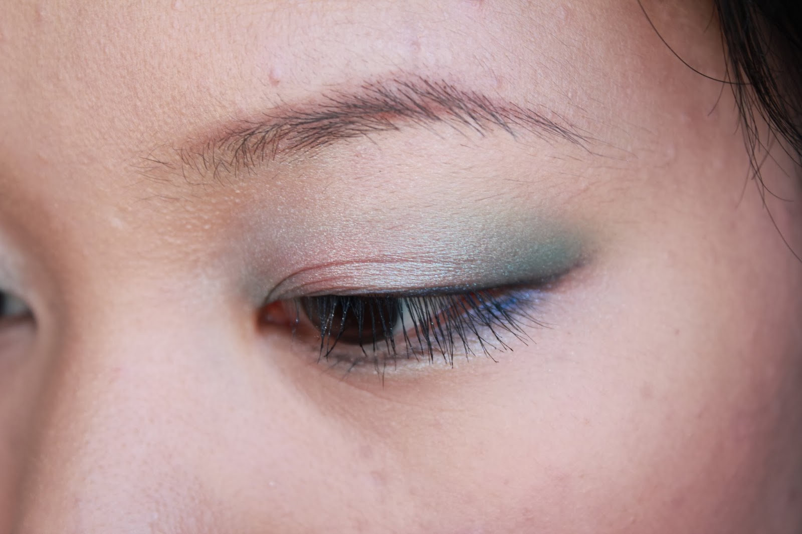
The second last quadrant to be reviewed of the Em Cosmetics Beach Life Palette is filled with promising neutral bronze-y shades, as one would expect from something called a Beach palette.The previous two quadrants reviewed (Sunshine Lover and Poolside) had a mixture of hit and miss shadows, with Poolside being more successful in quality. Unfortunately, the quadrant today performed very poorly.

I swear this picture looked better on my camera

My god. This look like some nice neutral-ish  shades that can even be built up to make a party look, right? Righhht? Yeah. I was heavily disappointed when I started swatching these eyeshadows. Almost all have close to no pay-off and don't feel smooth at all. The peachy golden shade was a nice surprise, just in terms of the colour, I was expecting a duller colour looking at the product in the pan, but it turns more golden and satin-y when swatched. The medium bronzey brown shade (middle left) was probably the smoothest shadow, but the pay-off was the same disappointment.

The lipglosses (lipstick?) were super sticky, the same as the others. And they are quite shimmery, but the colours themselves are pretty nice. Once the majority of the product has faded or wore off (which is actually quite quickly), there are traces of gold sparkle left which gives the lips a nice sheen. 

The blush could possibly be the redeeming point of this palette. This is really smooth, nicely pigmented and has a nice sheen to it that adds a glow to your face. I think this is my favourite blush so far out of the entire palette (I mean, there are only four, though, but still). It's a peachy shade, but not too much glitter or sparkle, perhaps you could call it very smooth, even shimmer? I'm not even usually a fan of peachy blushes, but this looks nice and quite subtle in a good way on the cheeks.

Without Flash
With Flash
I wasn't expecting much from this palette quadrant when applying, based on the swatches, but, as usual, they did perform better on actual application. The shadows are just a slightly more pigmented version than the swatches, but most of them are pretty much accurate in their relation to each other (if that makes sense, the more pigmented swatches are more pigmented on the eyes than the less). The satin peach shade was used as a base and that's pretty much the best shadow that applied on the eyes. The rest were pretty much less average to average. And, in previous, while the colours matched well in the given look, the gold colour just didn't seem to fit to me as an inner corner highlight. Blending a bit on the browbone was pretty okay, but it just seemed a bit of a stretch.

The lipglosses were sticky on the lips as I expected and lasted not long at all, maybe about half an hour to an hour? Just a clear gloss with a bit of shine is all it is really.

The blush was fantastic as I was expecting, and it does apply quite sheer on the cheeks. But you can build it up and it doesn't look patchy, though it gives a nice slight sheen on the cheeks. It goes quite well with my NC30 skintone; I don't really see this shade working too well on lighter skintones, although it could perhaps work as a highlighter for deeper skintones. It's not too shimmery too which I like about it.


Before
After


I stand by comments earlier in this post: this quadrant is the most disappointing in this palette. The quality is just not there, the pay-off is very lacking and the shadows are hard as anything. The lipglosses are sticky and the longevity is pitiful. Again, the only redeeming factor could perhaps be the blush. It's smooth, with a nice finish and a gorgeous colour for medium skintones. I can slowly see what I would actually be using and what will take more work, so the travel palette would work out nicely to choose out the pans that will actually be worth it.

Wednesday, November 13, 2013

The underrated Chanel blushes

My, my, you say you're a blush fanatic? Well, sorry (I'm not sorry), you don't know blushes until you've tried Chanel Joues Contraste Powder Blushes. As much as I love cheek products, there's not much hype over the ones by Chanel, but mostly what I've heard is that they're quite underrated; most people preferring to pick up the (slightly) less expensive NARS or Tarte. But I've owned both NARS and Tarte blushes, and while I do quite enjoy Tarte with a light hand, I've never quite been able to pull off any of my NARS blushes properly. In fact, dare I might say that I find them to be overrated. Either way, a few weeks ago, feeling in need of a pick-me-up, I thought I would listen to that ebbing of try out the Chanel blushes, you'll be pleasantly surprised, and off I went to Myer to pick up two from the Chanel counter, a pretty pink shade in Rose Initiale (72) and a more everyday, nude shade in Espiegle (65). 


rose initiale
espiegle
Rose Initiale (72)
A lovely slightly blue-tone pink, I can see this shade working on a number of skintones. On the cheeks, it's a lot more subtle than it looks in the pan, but these blushes are easily buildable or you can have a gentle flush. It's the type of shade that looks like you're actually blushing, rather than having, well, blush on your face. I'm not the type to wear this pink blush everyday, but the season is right for it, so I've been a bit more rosy than usual. I haven't tried the included brush, instead prefering to use a soft stippling brush to apply it; these blushes do kick up a bit of dust, so a firmer brush would be a bit harsh. Oh, and it smells like roses! I wasn't expecting that, but it's not too overpowering, only when you actually go in for a little sniff of the product.

Espiegle (65)
This blush I've been wearing a lot more often, as it is quite the nude/neutral everyday shade. It looks a bit frosty, a light orange-y shade, but don't let that alarm you. When applied, it adds a nice touch of subtle colour to your face, with a gentle, overall glow. No frosty, orange cheeks in sight. You would think that this blush would be harder to pull off than the Rose Initiale, but I absolutely love it, and it looks wonderful on my slowly tanning skin (approximately an NC30). This is a really good shade for Summer coming up (well, considering the weather, it might as well already be), perhaps I might use it more as an illuminator when my skin deepens further. This blush also smells like roses, but, and this may just be me, maybe not quite as strong as Rose Initiale. 

left to right, without flash: rose initiale heavy swatch, rose initiale blended, espiegle heavy swatch, espiegle blended
With Flash
Sunlight
God, don't those colours look so pretty? I know arm swatches can prove quite different on the face, but these are so easy to apply and blend out, there's no way that you can look clownish with these. I think my favourite thing about Chanel blushes is that, somehow, they just have a very flattering way of making your skin glow. As the weather is warming up, I'm finding that I'm starting to get a bit more shiny, not oily, but a little more than I would like, yet these blushes look wonderful with a slight dewy finish. From what I've heard, there are two formulations of this blush (one in the circle pan like I've got, and a square pan in Europe, though correct me if I'm wrong), with one being softer and the other, obviously harder. I'm not entirely sure which one I got, but these are smooth and lovely, they may kick up a bit of dust, but not too much, either way, they apply beautifully.


I can see myself getting good use out of these blushes, considering the use I'm getting out of them currently. They are just so easy to apply, and, oh, do they add that nice healthy glow to your face. I'm slowly delving into Chanel products, but I have not been disappointed so far, truly what a luxury brand should be, I think. 

I purchased these Chanel Joues Contraste powder blushes from Myer for AU$71 each. 

Sunday, November 3, 2013

Back to Basics

Ah, I think I finally get the hype of Urban Decay products. Probably not the full extent, but I'm definitely beginning to form an affinity, the Naked Basics palette is fast becoming my favourite eyeshadow palette. Ever since my mum brought it back from her trips to the Americas, I've been using it every single day. I mean, I knew I liked using neutrals, but jeez, this brings it to a whole new level.


I love the packaging, always a fan of that rubberised casing that's reminiscent of NARS packaging and MAC, on occasion. The size of the palette is also really nifty for travelling, and the mirror is actually quite good; the hinge helps it to stay put too, so it's a palette with an actually useful mirror. The only thing that annoyed me was, for some silly reason, I had trouble opening this palette, as you can see, my nail punctured the lovely Venus shade. But I suppose that's an example of how soft and buttery these shadows are. Either way, I've managed to master the clasp, it is easier without thinking about ruining my fake nails.

left to right, without flash: venus, foxy, walk of shame, naked 2, faint, crave
With Flash
Sunlight
These shades seem pretty light, one might think that they're more for lighter skintones. But even for my medium/medium-light skin (NC25-30). Five matte shades and one shimmery highlight shade; I love ALL of these. My favourite combinations include walk of shame as an allover wash, and then naked 2 as more colour on the lid; or naked 2 as an allover, contouring with faint and then any of the lighter shadows as a brow highlight. Crave makes a fantastic liner too, it looks great on the lower lash line too, it's not too black, but more of a brown-black so it doesn't look too harsh. The two lighter matte shades foxy and walk of shame work well as neutralizing shades on the lid, with foxy being yellow toned and walk of shame more pink. The payoff for foxy is not as good as the other shades in the palette, though, and crave wouldn't work as well as a base shadow I don't think. But definitely naked 2 is my favourite shade out of the palette, looks fantastic on the eyes to add a bit of depth, it's a nice light taupe-y colour, perfect for the "nude" look.


Really, this was the best palette that I could have received, considering how much I've been using it now, I can easily see myself using this a lot more in the future, especially taking this with me when travelling time comes around. Feels very sleek and luxurious, so I'm quite lucky to have gotten my hands on this baby.

This was purchased for me (by my mother) from Sephora for US$27, available here.

Tuesday, October 22, 2013

Em Cosmetics Beach Life Palette: Poolside Look

I'm really quite enjoying playing around with this Beach Life Palette by Em Cosmetics. There's just a lot of choice, and what with the huge range of reviews from saying "I returned this" to "this is the best palette ever", of course you have to find out yourself what really works in order to get a good impression. I decided to go a bit brighter and more out-there today, and went for the fourth quadrant of the palette that has got a lot of blues and shimmery white.


This quadrant has actually got quite a few impressive shadows. The blues are fantastically pigmented, and the shimmery white highlight is particularly vibrant. The majority are smooth and show a lot of colour in just one swipe, the exception for this, however, is that peachy pink eyeshadow. That one is actually a bit rough in texture, nowhere near as smooth as the others. None of them really kick up that must dust either, not even the white shade which I fare to be the butter-iest, but the dark blue shade (like the dark shade of the third quadrant) does have the slightest bit of fluff to it. Again, a shame because it's so dark and close to the lip products.

The lipgloss is pretty nice, a bit more solid than the lipgloss from the Sunshine Lover look, but it is quite pale, so it doesn't work too well on my pigmented lips and skintone. The lipstick is very, very soft and squishy, I can't imagine this being in an actual bullet form. It's of sheer pigmentation too, but a nice orange tone.

The blush is really nice in this quadrant too, it's very smooth and quite pigmented. No dust either. It has a slight sheen to it, maybe a little more than a satin finish, but really no shimmers in it. It leans more pink than in the pan which I quite like, but it does keep the peachy coral undertone. This is really nice for, I would assume, almost all skintones, even much paler and deeper skintones alike.


left to right, without flash: anti-clockwise starting from the top left corner

With Flash
I used the designated look again for this quadrant called "Poolside". These eyeshadows apply really nicely on the eyes, pretty much on par to the swatches and they blend really well, the peachy pink applies better than the swatch, though. This is really quite the frosty look, because of the combination of the blue and the white in particular, so I suppose this could be a look for a "pool party" I suppose. But it still quite bright. I used the dark blue for a liner as I wanted a more deeper liner look, just to contrast a bit better with all the lighter shades. As much as I love how easy it is to line with the shadow using the angled brush included, the order of instructions perplexes me, in that you line your eyes and then add the shadows. It diffuses the line a bit too much for my liking.

The blush is really quite nice, a bit more sheer on my skintone, but I like going light on the blush. It probably would have worked better with a denser brush, but the eyes were so bright, I was hoping for a more neutral rest of the face. 

I used the lipgloss for this look, it is quite light and sheer even though the designated look says that the lipgloss is more for a 'pop' look, I don't really see it being a 'pop' colour.


Before

After

Close-up of the eyes
While I do like that they give you looks to follow, it does use a bit too many of the colours, I feel, and the order is a bit whack. If you're following the look given, it really almost defeats one of the main ideas of the palette being that it's for the woman on-the-go. There are quite a few steps, and the liner pretty much disappears after applying the other shadows, but it's nice if you apply it on the lower lash line, especially the deep blue. These shades will probably make it into my favourites from the palette, just based on how smooth and pigmented they are. I don't think they are the creamiest I've ever tried, but they can probably gain the "luxury" name these are meant to have. Again, a more out-there look, but if you love blues, these are pretty decent.